Showing posts with label The Business. Show all posts

Monday, February 6, 2012

Renaissance "Love" gets published- Baltimore Bride Magazine

Magazine issue cover
Even tho I am satisfied when I feel proud of work I have done, it still feels all warm and tingly to be publicly recognized. In the upcoming Spring/Summer issue of Baltimore Bride Magazine, Renaissance Photography’s work has been featured on a 2 page spread. In a section about destination weddings, they highlight Derrick and Markia Henderson, my clients’ wedding that I photographed in Montego Bay, Jamaica. 


Collection of images from the article
Main picture of the article


 This was definitely one of the best weddings I have had the privilege to shoot. The class level was top notch. They put forth the greatest effort to be sure that the wedding was a total experience for all their guest and all their hard work paid off tremendously. My company also created mini videos for this amazing destination wedding so that this occasion could be experience time and time again for years to come. (videos are done in partnership with www.jaydexterphotoblog.com)

Welcome night

Wedding Day


It just does something to me to see my company name in magazine credits 


I have had the pleasure of photographing not only their wedding, but their engagement and even Derrick’s surprise proposal. So even tho photography can be seen as just a job, it becomes a lot more as you play an integral role in memorializing some of the biggest moments of people’s lives. 

The Proposal

The Engagement Shoot

The Wedding

“Follow” me on Twitter: www.twitter.com/RenaissanceDC 
“Subscribe” to my youtube: http://www.youtube.com/cruzanalex 

Saturday, December 10, 2011

T St Flats


Every time I do a renovation, I try to figure out a way to step my game up from the previous one. There is a lot of consideration that goes into the designs of these houses. It’s a great experience but can also be an agonizing one. Mainly because I don’t like repeating myself and the creative process can drive me a little insane. Everything just has to be RIGHT! And I don’t like to compromise on my vision. Here is the video of the finished urban modern renovation, “T St Flats”. ENJOY!

There is only so much information that can fit into a 9 min video on a project that is so large. But there are a few design details that I want to highlight and clarify beyond what I was able to show on screen. 


Lighting
I take extra care when picking out lighting because I really think that it makes a room. My consultant Kat at Maurice Electric has the patience of a saint. I will go thru catalogue after catalogue to make sure I have just the right fixture for a space. The “Crescendo” light fixture in the master loft really is a show stopper, but it is on the more expensive end. I made some compromised to fit it into the budget.  As far as I am concerned, under-cabinet lights are a must! it adds a different life to your kitchen. As you may have seen from me before in my previous renovation video The Catalyst, I am a fan of putting two side wall sconces in bathrooms to really give an even light on your face. It’s more effective than just having a light above the vanity mirror.


Tile
Tile is also another one of my favorite mediums. But another one that drives me crazy! Too many choices spawn too many ideas and then when you mix in a budget... ARGH! It would not be unusual to see me meditating on the floor in the middle of a tile showroom. I spent about 3 hours in there making my final selections. It’s about 2.5 hours of stressing and playing with options, then 30 minutes of an exhilarating mad dash thru the store grabbing things because I had that “AHHA” moment. I loved my tile rep at Architectural Ceramics (she sends me homemade cookies and treats) but sadly she recently left the company. I could have shed a tear. It’s so important to have the right person who can pull together all of the craziness and competing ideas.  


Kitchen
I decided to use two different color countertops. A white for the main area and a dark taupe for the island. To  keep the kitchen visually appealing, I also varied the color of the cabinets to create more contrast. I used a medium brown with the white countertops and white cabinets for the dark countertop. The countertops are Caesarstone. This particular type has bits of recycled material throughout that makes it eco-friendly. Due to how it is manufactured, it is less porous than marble so it holds less bacterial. It is also harder and more heat resistant. I was able to hunt for deals and came out cheaper than I would with a comparable granite. Notice that I did not put the typical 4”backsplash of countertop material, but instead ran the backslash tile all the way down to the countertop. That’s new school, the other way is traditional. I am also a big fan of Slide-in ranges or cooktops. This eliminates the bulky control panel that usually on the back of your range and also makes the controls accessible for people in wheel chairs. Ever since my catalyst project I have become a big fan of built in microwaves also. 


Built in Surround Sound
This was a new feature for me to incorporate. Fortunately I have an amazing  audio subcontractor on my team who was able to educate me on the subject. I didn’t get a chance to go into detail on how it worked in the video. It’s in the top unit and broken into two zones. There is one for the main living area and another for the master bedroom loft. The two can play different or the same music. But can also play surround sound from the TV or your favorite radio stations. It also has speakers to the out door decks and patios.
Out door spaces
As an island boy, outdoor living spaces are a must for me. So we incorporated a semi-private garden area on the basement level to escape the city. I really love how the garden turned out, but I know I am going to really love it when the plants mature. I incorporated one of my favorite trees, the Japanese Maple, the will provide shade for the bench. 
 Shopping for these plants was an “experience” to say the least. Shopping with me in general is a trip. I know what I wanted without knowing what I wanted (I hope that makes sense). I know I wanted a shrub, that grows a certain height, blooms a certain color that can work in a certain kind of shade and sunlight. It doesn’t help that I shop like I think; like a madd man. Luckily the staff at Old City Green was patient, knowledgeable and accommodating. 
For more outdoor space we also incorporated back patios off of the master bedroom on the top two units. The master loft also is set up to accomidate a large sized rooftop deck that has amazing views since the house sits on an elevated lot.


Front Entrance
I wanted to create a feeling that was a mix of private but inviting as people approached the house. I decided to construct a half wall on the right side of the stairs and cover all the exterior surfaces with a Pennsylvania blue flagstone, capped with limestone. But to keep it from being an overpowering amount of hard surface,  I decided to have a horizontal open railing system on the left side of the stairs. I curved the railing around the front half wall to give the urban oasis garden a semi-private feel. Thanks to the staff at Ernest Maier for helping me pick the palette of stones that worked just right for the project.


Doors
I admittedly have some weird fetish for doors. I am sure I can come up with a deep underlying meaning stemming from it being the portals to your space and your appetizer for the interior, but I think I just like em. I am slowly building a collection of custom Designed doors that I use in my renovations. For T St Flats I created the “Full Tower” and “Slim Tower” door, constructed by Rollin Supply. And just like everything else, it was designed the way it is for a reason. I wanted to mimic the towering posture of the building that boast 4 tall floors on a relatively slim lot. The small rectangle on the bottom mimics the basement unit. The larger middle rectangle is for the main living spaces and another small rectangle on top for the loft top floor.


Sidenote: I really don’t like your basic 6-panel doors for interiors. It’s soooo builder’s standard and doesn’t set your space apart. On this project I used a slightly more expensive 2-panel door from Home Depot for all the interiors.
The “Show Stopper”- The Glass Wall
So everyone seems to be in love with the glass wall. When I say that  I dream about design, I mean that literally! I saw this glass wall in my dream one night, woke up and sketched it out, then designed everything else around it. At the time I didn’t know much about what the final design was going to be, but I knew this had to be a part of it. 

If you know of someone doing a urban modern renovation, be a friend and share this link. I hope this information was helpful, I look forward to your comments and questions. And SUBSCRIBE to this blog! Thanks!
Sources
Just tell them H. Alex Sanchez (please don’t forget the H.) sent you and they’ll treat you right.
General Contractor- Kofi Construction (240)-793-1207
Audio- Nerical-ask for Cristian
Cabinets- IKEA (College Park) - ask for Able or Esta
Glass, mirror and shower enclosure- Amalfi Glass-ask for Reed
landscaper- Mac- (202) 536-0085
Custom staircase- Integrated Design Solutions ask for Shawn
Stone- Ernest Maier
Countertops- Aguillar’s Marble and Granite- ask for Mr. Aguillar
Tile- Architectural Ceramics (Rockville)-ask for Shanda
Door Manufacturer- Rollin Supply- ask for Mike Tignal
Lighting- Maurice Electric (DC)- ask for Kat
Flooring- Lumber Liquidators (Beltsville, MD)
Videography- John Ledbetter
Video Graphics and Animation- Depi Depisoir
“Follow” me on Twitter: www.twitter.com/RenaissanceDC 

“Subscribe” to my youtube: http://www.youtube.com/cruzanalex 

Saturday, October 29, 2011

My Image Rollercoaster


My very good friend, Nicholas Hawkins, owner of the image consulting company Young Gentleman Society, has been given he unfortunate task of being my image consultant (No, I am not hollywood, just smart enough to know that my image contributes a large part to my success) for the last year. I have hired and fired him a record of 5 times over the course of one weekend (can we say "high maintenance"). Admittedly, because of my own issues.
I have so many ideas and so many concepts of how my life should be lived that conflict with each other, causing one bad ass roller coaster of personal presentation. It was difficult for me to find a balance of holding on to who I was, becoming who I want to be, and changing the things that weren't aligned with my vision. Even tho the path was turbulent, the goal was always the same; authenticity.

I decided a few years ago that I will never live life unhappy, restricted or too calculated. So as my style started to change from "barefoot island athlete" to "artistic business owner and public figure", I rebelled. Afraid that I was somehow being disingenuous from who I was. So my roller coaster with my image consultant went from "photoshoot fresh, looking like wealth" to "true artists live off the land and make clothes from the sheep I raised". Needless to say that this made it impossible for Nick to work with me.
But in retrospect, the struggle was a necessary one. It came from a good place. I just never want to portray something that I am not. The problem was that it was hard for me to accept that I am not the same person I was growing up. I am not in the same position and I am working on different goals. But I still have the same beliefs and morals, and that's what needs to be held close. I just had to get comfortable with being me and own it!


So now, Nick is back on the team for the 12th time (I'm a handful). He and his staff have the patience of saints. But this time I have learned to accept a few things. I was putting too much emphasis on what was on the exterior. Putting on a suit doesn't change that I am simple island boy. And dressing like a vagrant doesn't negate my education or my potential altitude. I had to fight my fear of becoming materialistic and accept that I am a fan of fashion. I like looking nice. I like expressing myself through my personal presentation. And fighting against that so the I can stay "real" was my biggest form of being unauthentic.
As I write this I am back home in the Virgin Islands. Now, I go to a regular local spot in a linen button up and chinos. Yes, I definitely stand out among the oversized T shirts and du-rags but I am not going to force fit myself into any group. I have ti face that I am not that guy anymore. But what I have found is that a few things happen when you present yourself, as yourself, confidently. People take notice and want to know who you are , you attract people to you on a greater level and you feel less pressure to make moral compromises.
So yes, I flew into the island with a shirt and tie on. Why not? I'm a business man (or as I say "I own some stuff!"). I like the way I am treated when I wear a tie. I like working internationally, so when I give people my business card in airports, wearing my suit rather than my flip flops, they stare, read intently, and carefully put it away to find later. but even more importantly... I just feel good!
When I go out. I like to keep it more simple and less stuffy (still stylish because I like fashion as art). I like to be comfortable because the point of going out is to relax and have fun. So the odds are finding me at a spot that has a "strict dress code" unless it's for business or a special event, is slim. Because although I like fashion, profiling (the young professional DC scene is famous for this) is not my idea of fun.
I remember my former boss, millionaire club owner Marc Barnes, making a statement to this effect, "I don't understand why people buy all these fancy clothes to go out, but look like crap when they come to work. You should look better when you are making money than when you are spending it". (Knowing him, I'm sure there were a few profanities littered throughout the statement but you get the point)
"Your playing small does not serve the world. There is nothing enlightened about shrinking so that other people won't feel insecure around you. We are all meant to shine, as children do. We were born to make manifest the glory of God that is within us. It's not just in some of us; it's in everyone. And as we let our own light shine, we unconsciously give other people permission to do the same. As we are liberated from our own fear, our presence automatically liberates others." - Marianne Williamson "Our Deepest Fear"
Well now my roller coaster is slowly become a less turbulent ride. But it had to start with self acceptance, courage and confidence. Thanks for reading!


“Follow” me on Twitter: www.twitter.com/RenaissanceDC 
“Subscribe” to my blog: http://halexsanchez.blogspot.com/

Wednesday, August 10, 2011

Bachelor Home Office


My task at hand was to take the empty room that was a catch all an make it into a functional work space. Armed with a modest budget and creativity here are the results from this bachelor home office design.

The color palette is simple but very
intentional. Beige with gray tones give a neutral backdrop with a masculine, contemporary feeling. The muted red provides energy and life. The deep dark brown wall texture anchors the room and adds elegance. The colors work together to achieve a goal. contemporary, cozy, elegant and interesting.


The wall texture is subtle but sick (that means really cool for the slang illiterates)! It's a dark brown natural reed wallpaper that adds texture to the space without becoming fussy. It's illuminated by very contemorary wall scones (of course it is set on dimmers) on either side of the desk area. The only thing left is to bring in a huge oil rendering of my client between the lights, a lit cigar and you will have a space fit for a BOSS (Said in my best Rick Ross voice [the rapper not the mobster {btw- I don't condone smoking ]}). I got side tracked, where was I? oh yeah, the design...


I brought in different but complimentary pottery as a collection. I wanted to have something to contract all of the straight lines and had a bit more of an organic feel. I also framed pitures I took, the metro collection to add an urban feel to the space. In retrospect, a plant will go well in this room even tho it as not part of the finished design.
The metro collection by Renaissance Photography


In any room the lighting is key! instead of springing the bucks for strategically placed recessed lighting, I decided for an inexpensive adjustable track light on a dimmer). This enables us to create a mood in the space. The lighting draws your attention to key elements and gives the room it's drama.


Offices have a way of collecting stuff. With that in mind, I kept the accessories to a minimum and storage to a maximum. I used the entire back wall to assemble a modular storage unit that takes advantage of the vertical space in the room without eating up valuable floor space.
FENG SHUI
Let's talk Feng Shui! I am far from being an expert but I do utilize some of it's practices in my designs, because a room is just as much about how it feels as it is about how it looks! here are some of the principles that I implemented on this design.
1. Having a clearly separated space between your work and living area is important. it's even suggested that you take a short walk before and after spending time in your home office to keep your personal and business lives separate. If you don't have a separate room. use a room divider to block off your work area.
2. Do not have you back to the door
3. it's best to have your office facing east (that just happened to work out well for this project)
4. Red is a color that promotes energy in all your career efforts
5. Dont not place you desk under a window, it's best to have the light wash over it from the side.
6. Have ample storage because clutter prevents the free flow of energy throughout the room.


Check out my mini-vid as I walk thru the space and give more insight on the design.


“Follow” me on Twitter: www.twitter.com/RenaissanceDC 
“Subscribe” to my youtube: http://www.youtube.com/cruzanalex

Monday, January 24, 2011

The Mini Suite-Guest Bedroom Design


T h e M i n i S u i t e


Guest Bedroom Design


This projects takes a very small, blank space, and converts it into a fun, comfortable and welcoming guest bedroom on a small budget. By using store bought pieces and combining styles, I created a funky and contemporary space.


The original space was plain box, measuring less than the 10'x10' of a standard bedroom with nothing but an air mattress and lamp. With a budget of $2200 for materials and furniture this is what I turned it into...

Start with the basics... Paint!
Color: If you are not an expert with color, please take the time to get sample paint and put it up in the walls for test swatches. Get others opinions on your color choices. Let's face it, not every color that looks good as a dress will be as hot on your walls. But regardless of what color you get, it will be the same price, so budget is no excuse for having a horrible color on your walls!

Type: In this application I went with a flat enamel paint. I find it to be more sophisticated and if you have walls that are a little older, flat paint hides imperfections better than other finishes. I choseto use "flat enamel" because regular flat paint is easy to scuff and not able to be wiped down. With the flat enamel, it may cost a little more, but it will save you headache and also prevent constant touch-ups.

Note: I highly recommend spending the extra money to get "NO VOC" paints (paints with no toxins) also. Especially in nurseries and kids rooms. Our goal isto make our guest feel comfortable, not kill em slowly.

Furniture
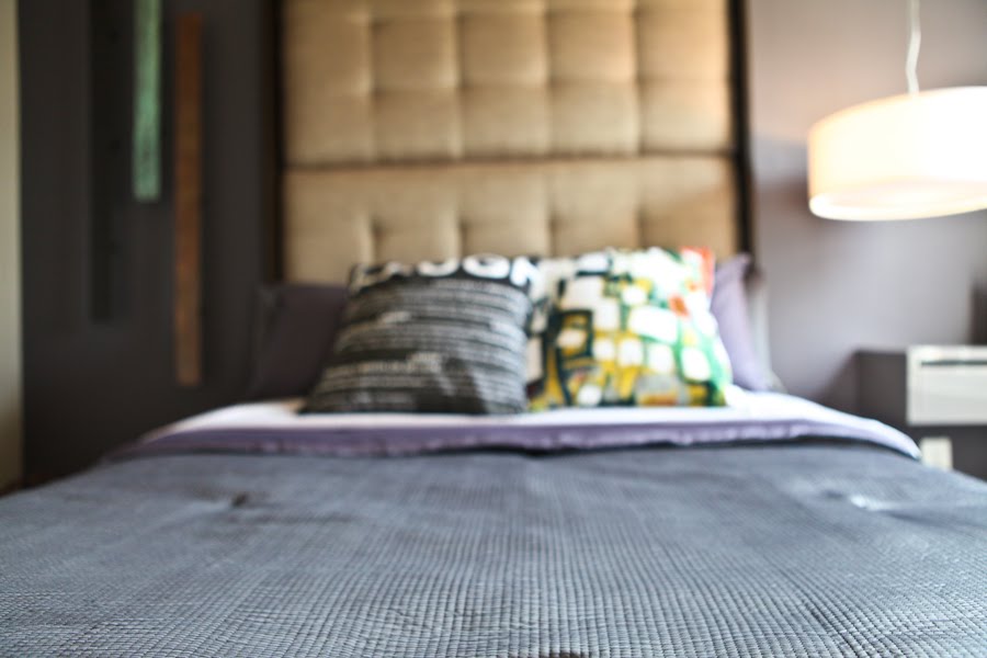
It was important to keep this small space uncluttered but still dramatic. Simple tricks helped achieved this goal. I purchased 2 inexpensive fabric headboards and mounted them together on the wall. Then I built a basic frame to give it a more finished look. This method created a dramatic bed without eating up any floor space. Instead of using floor lamps, I decided to suspend the main lighting element from the ceiling. This gives you a little something different and saves space for the same price of having a standard floor lamp.
Another method of space saving was to have a wall mounted storage unit as a bedside table. It provides a usable service and storage without taking away from the limited square footage. I brought in a condo sized dresser since the need for clothes storage is at a minimum but the need for space is at a maximum.

Bedding
I think it is important to have good quality sheets for your guest to make them feel pampered. So I spent a little more for this Gray and Purple Vera Wang comforter set and mixed and matched it with coordinating sheets. Purple is that new hot color that, when paired right, can work for either sex and numerous styles.

Note: Many top designers make less expensive lines of home products that you can find in stores like Target, Khols, TJMaxx, marshalls....


What is a guest room without a little fun. Integrating fun graphic pillows is a great way to add personality to your space.

Accessories
I like rustic elements! It adds something a little rough and interesting to a space. So I brought in these patinaed metal bars from CB2 to add that bit of variety and fun.
As a photographer I was able to incorporate my own photography art work into the space. For this project I used my serioes "The Capitol Collection" to add a sophisticated, sleek, urban feel to the room.
Everything has a meaning for me. I brought in empty frames to leave it open for imagination. Having personal photos in a guest room is a reminder to visitors that they are not in their own space. The empty frames are to symbolize them having pictures of their own friends and family to make them feel more at home.

This artwork was a very inexpensive online purchase that adds interest because of it's size and mix media. It is a great way to make a budget friendly make-over feel a lot more expensive.

Note: try searching for art on discount websites such as www.overstock.com and www.art.com

This is ultimately a room for sleeping... So bring on the tranquility symbolisms.

For accessories, I believe you have to be a little fearless. This is what really gives the room its personality and individualism. Forget what they told you, it's really a personal choice, but the trick is showing restraint to not over-accessorize. The talent comes with deciding scale, proportions and compositions.

Play with scale-Oversize vases on a small dresser
Play with texture and materials-Natural twig spheres, transparent metal lamp shades
Play with color- personalized travel souveniers from the owner, graphic artwork

Here is the video walk thru of the space. I hope you enjoyed viewing this design as much as I enjoyed creating it!


“Follow” me on Twitter: www.twitter.com/RenaissanceDC 
“Subscribe” to my blog: http://www.youtube.com/cruzanalex

Popular Posts