Showing posts with label Design Work. Show all posts

Saturday, December 10, 2011

T St Flats


Every time I do a renovation, I try to figure out a way to step my game up from the previous one. There is a lot of consideration that goes into the designs of these houses. It’s a great experience but can also be an agonizing one. Mainly because I don’t like repeating myself and the creative process can drive me a little insane. Everything just has to be RIGHT! And I don’t like to compromise on my vision. Here is the video of the finished urban modern renovation, “T St Flats”. ENJOY!

There is only so much information that can fit into a 9 min video on a project that is so large. But there are a few design details that I want to highlight and clarify beyond what I was able to show on screen. 


Lighting
I take extra care when picking out lighting because I really think that it makes a room. My consultant Kat at Maurice Electric has the patience of a saint. I will go thru catalogue after catalogue to make sure I have just the right fixture for a space. The “Crescendo” light fixture in the master loft really is a show stopper, but it is on the more expensive end. I made some compromised to fit it into the budget.  As far as I am concerned, under-cabinet lights are a must! it adds a different life to your kitchen. As you may have seen from me before in my previous renovation video The Catalyst, I am a fan of putting two side wall sconces in bathrooms to really give an even light on your face. It’s more effective than just having a light above the vanity mirror.


Tile
Tile is also another one of my favorite mediums. But another one that drives me crazy! Too many choices spawn too many ideas and then when you mix in a budget... ARGH! It would not be unusual to see me meditating on the floor in the middle of a tile showroom. I spent about 3 hours in there making my final selections. It’s about 2.5 hours of stressing and playing with options, then 30 minutes of an exhilarating mad dash thru the store grabbing things because I had that “AHHA” moment. I loved my tile rep at Architectural Ceramics (she sends me homemade cookies and treats) but sadly she recently left the company. I could have shed a tear. It’s so important to have the right person who can pull together all of the craziness and competing ideas.  


Kitchen
I decided to use two different color countertops. A white for the main area and a dark taupe for the island. To  keep the kitchen visually appealing, I also varied the color of the cabinets to create more contrast. I used a medium brown with the white countertops and white cabinets for the dark countertop. The countertops are Caesarstone. This particular type has bits of recycled material throughout that makes it eco-friendly. Due to how it is manufactured, it is less porous than marble so it holds less bacterial. It is also harder and more heat resistant. I was able to hunt for deals and came out cheaper than I would with a comparable granite. Notice that I did not put the typical 4”backsplash of countertop material, but instead ran the backslash tile all the way down to the countertop. That’s new school, the other way is traditional. I am also a big fan of Slide-in ranges or cooktops. This eliminates the bulky control panel that usually on the back of your range and also makes the controls accessible for people in wheel chairs. Ever since my catalyst project I have become a big fan of built in microwaves also. 


Built in Surround Sound
This was a new feature for me to incorporate. Fortunately I have an amazing  audio subcontractor on my team who was able to educate me on the subject. I didn’t get a chance to go into detail on how it worked in the video. It’s in the top unit and broken into two zones. There is one for the main living area and another for the master bedroom loft. The two can play different or the same music. But can also play surround sound from the TV or your favorite radio stations. It also has speakers to the out door decks and patios.
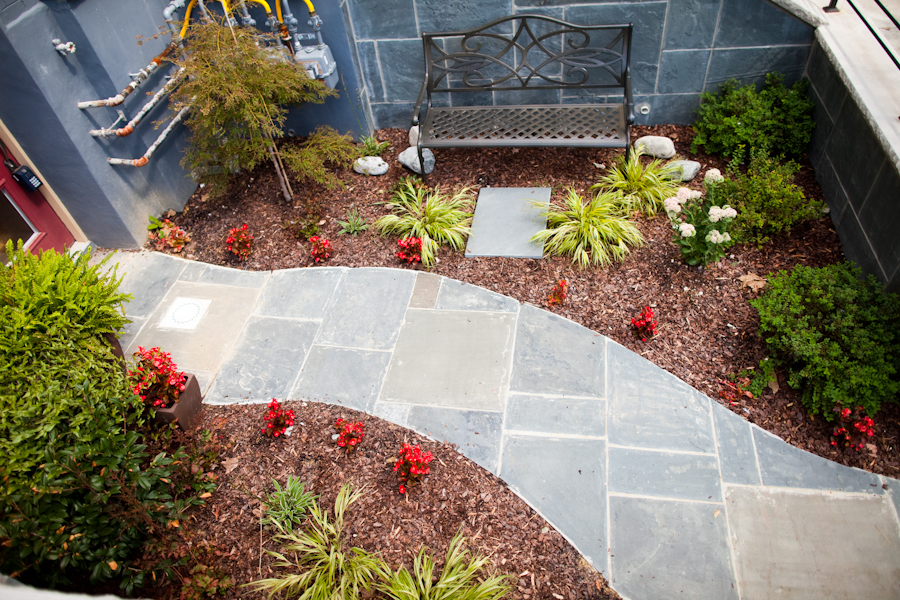
Out door spaces
As an island boy, outdoor living spaces are a must for me. So we incorporated a semi-private garden area on the basement level to escape the city. I really love how the garden turned out, but I know I am going to really love it when the plants mature. I incorporated one of my favorite trees, the Japanese Maple, the will provide shade for the bench. 
 Shopping for these plants was an “experience” to say the least. Shopping with me in general is a trip. I know what I wanted without knowing what I wanted (I hope that makes sense). I know I wanted a shrub, that grows a certain height, blooms a certain color that can work in a certain kind of shade and sunlight. It doesn’t help that I shop like I think; like a madd man. Luckily the staff at Old City Green was patient, knowledgeable and accommodating. 
For more outdoor space we also incorporated back patios off of the master bedroom on the top two units. The master loft also is set up to accomidate a large sized rooftop deck that has amazing views since the house sits on an elevated lot.


Front Entrance
I wanted to create a feeling that was a mix of private but inviting as people approached the house. I decided to construct a half wall on the right side of the stairs and cover all the exterior surfaces with a Pennsylvania blue flagstone, capped with limestone. But to keep it from being an overpowering amount of hard surface,  I decided to have a horizontal open railing system on the left side of the stairs. I curved the railing around the front half wall to give the urban oasis garden a semi-private feel. Thanks to the staff at Ernest Maier for helping me pick the palette of stones that worked just right for the project.


Doors
I admittedly have some weird fetish for doors. I am sure I can come up with a deep underlying meaning stemming from it being the portals to your space and your appetizer for the interior, but I think I just like em. I am slowly building a collection of custom Designed doors that I use in my renovations. For T St Flats I created the “Full Tower” and “Slim Tower” door, constructed by Rollin Supply. And just like everything else, it was designed the way it is for a reason. I wanted to mimic the towering posture of the building that boast 4 tall floors on a relatively slim lot. The small rectangle on the bottom mimics the basement unit. The larger middle rectangle is for the main living spaces and another small rectangle on top for the loft top floor.


Sidenote: I really don’t like your basic 6-panel doors for interiors. It’s soooo builder’s standard and doesn’t set your space apart. On this project I used a slightly more expensive 2-panel door from Home Depot for all the interiors.
The “Show Stopper”- The Glass Wall
So everyone seems to be in love with the glass wall. When I say that  I dream about design, I mean that literally! I saw this glass wall in my dream one night, woke up and sketched it out, then designed everything else around it. At the time I didn’t know much about what the final design was going to be, but I knew this had to be a part of it. 

If you know of someone doing a urban modern renovation, be a friend and share this link. I hope this information was helpful, I look forward to your comments and questions. And SUBSCRIBE to this blog! Thanks!
Sources
Just tell them H. Alex Sanchez (please don’t forget the H.) sent you and they’ll treat you right.
General Contractor- Kofi Construction (240)-793-1207
Audio- Nerical-ask for Cristian
Cabinets- IKEA (College Park) - ask for Able or Esta
Glass, mirror and shower enclosure- Amalfi Glass-ask for Reed
landscaper- Mac- (202) 536-0085
Custom staircase- Integrated Design Solutions ask for Shawn
Stone- Ernest Maier
Countertops- Aguillar’s Marble and Granite- ask for Mr. Aguillar
Tile- Architectural Ceramics (Rockville)-ask for Shanda
Door Manufacturer- Rollin Supply- ask for Mike Tignal
Lighting- Maurice Electric (DC)- ask for Kat
Flooring- Lumber Liquidators (Beltsville, MD)
Videography- John Ledbetter
Video Graphics and Animation- Depi Depisoir
“Follow” me on Twitter: www.twitter.com/RenaissanceDC 

“Subscribe” to my youtube: http://www.youtube.com/cruzanalex 

Wednesday, August 10, 2011

Bachelor Home Office


My task at hand was to take the empty room that was a catch all an make it into a functional work space. Armed with a modest budget and creativity here are the results from this bachelor home office design.

The color palette is simple but very
intentional. Beige with gray tones give a neutral backdrop with a masculine, contemporary feeling. The muted red provides energy and life. The deep dark brown wall texture anchors the room and adds elegance. The colors work together to achieve a goal. contemporary, cozy, elegant and interesting.


The wall texture is subtle but sick (that means really cool for the slang illiterates)! It's a dark brown natural reed wallpaper that adds texture to the space without becoming fussy. It's illuminated by very contemorary wall scones (of course it is set on dimmers) on either side of the desk area. The only thing left is to bring in a huge oil rendering of my client between the lights, a lit cigar and you will have a space fit for a BOSS (Said in my best Rick Ross voice [the rapper not the mobster {btw- I don't condone smoking ]}). I got side tracked, where was I? oh yeah, the design...


I brought in different but complimentary pottery as a collection. I wanted to have something to contract all of the straight lines and had a bit more of an organic feel. I also framed pitures I took, the metro collection to add an urban feel to the space. In retrospect, a plant will go well in this room even tho it as not part of the finished design.
The metro collection by Renaissance Photography


In any room the lighting is key! instead of springing the bucks for strategically placed recessed lighting, I decided for an inexpensive adjustable track light on a dimmer). This enables us to create a mood in the space. The lighting draws your attention to key elements and gives the room it's drama.


Offices have a way of collecting stuff. With that in mind, I kept the accessories to a minimum and storage to a maximum. I used the entire back wall to assemble a modular storage unit that takes advantage of the vertical space in the room without eating up valuable floor space.
FENG SHUI
Let's talk Feng Shui! I am far from being an expert but I do utilize some of it's practices in my designs, because a room is just as much about how it feels as it is about how it looks! here are some of the principles that I implemented on this design.
1. Having a clearly separated space between your work and living area is important. it's even suggested that you take a short walk before and after spending time in your home office to keep your personal and business lives separate. If you don't have a separate room. use a room divider to block off your work area.
2. Do not have you back to the door
3. it's best to have your office facing east (that just happened to work out well for this project)
4. Red is a color that promotes energy in all your career efforts
5. Dont not place you desk under a window, it's best to have the light wash over it from the side.
6. Have ample storage because clutter prevents the free flow of energy throughout the room.


Check out my mini-vid as I walk thru the space and give more insight on the design.


“Follow” me on Twitter: www.twitter.com/RenaissanceDC 
“Subscribe” to my youtube: http://www.youtube.com/cruzanalex

Monday, January 24, 2011

The Mini Suite-Guest Bedroom Design


T h e M i n i S u i t e


Guest Bedroom Design


This projects takes a very small, blank space, and converts it into a fun, comfortable and welcoming guest bedroom on a small budget. By using store bought pieces and combining styles, I created a funky and contemporary space.


The original space was plain box, measuring less than the 10'x10' of a standard bedroom with nothing but an air mattress and lamp. With a budget of $2200 for materials and furniture this is what I turned it into...

Start with the basics... Paint!
Color: If you are not an expert with color, please take the time to get sample paint and put it up in the walls for test swatches. Get others opinions on your color choices. Let's face it, not every color that looks good as a dress will be as hot on your walls. But regardless of what color you get, it will be the same price, so budget is no excuse for having a horrible color on your walls!

Type: In this application I went with a flat enamel paint. I find it to be more sophisticated and if you have walls that are a little older, flat paint hides imperfections better than other finishes. I choseto use "flat enamel" because regular flat paint is easy to scuff and not able to be wiped down. With the flat enamel, it may cost a little more, but it will save you headache and also prevent constant touch-ups.

Note: I highly recommend spending the extra money to get "NO VOC" paints (paints with no toxins) also. Especially in nurseries and kids rooms. Our goal isto make our guest feel comfortable, not kill em slowly.

Furniture
It was important to keep this small space uncluttered but still dramatic. Simple tricks helped achieved this goal. I purchased 2 inexpensive fabric headboards and mounted them together on the wall. Then I built a basic frame to give it a more finished look. This method created a dramatic bed without eating up any floor space. Instead of using floor lamps, I decided to suspend the main lighting element from the ceiling. This gives you a little something different and saves space for the same price of having a standard floor lamp.
Another method of space saving was to have a wall mounted storage unit as a bedside table. It provides a usable service and storage without taking away from the limited square footage. I brought in a condo sized dresser since the need for clothes storage is at a minimum but the need for space is at a maximum.

Bedding
I think it is important to have good quality sheets for your guest to make them feel pampered. So I spent a little more for this Gray and Purple Vera Wang comforter set and mixed and matched it with coordinating sheets. Purple is that new hot color that, when paired right, can work for either sex and numerous styles.

Note: Many top designers make less expensive lines of home products that you can find in stores like Target, Khols, TJMaxx, marshalls....


What is a guest room without a little fun. Integrating fun graphic pillows is a great way to add personality to your space.

Accessories
I like rustic elements! It adds something a little rough and interesting to a space. So I brought in these patinaed metal bars from CB2 to add that bit of variety and fun.
As a photographer I was able to incorporate my own photography art work into the space. For this project I used my serioes "The Capitol Collection" to add a sophisticated, sleek, urban feel to the room.
Everything has a meaning for me. I brought in empty frames to leave it open for imagination. Having personal photos in a guest room is a reminder to visitors that they are not in their own space. The empty frames are to symbolize them having pictures of their own friends and family to make them feel more at home.

This artwork was a very inexpensive online purchase that adds interest because of it's size and mix media. It is a great way to make a budget friendly make-over feel a lot more expensive.

Note: try searching for art on discount websites such as www.overstock.com and www.art.com

This is ultimately a room for sleeping... So bring on the tranquility symbolisms.

For accessories, I believe you have to be a little fearless. This is what really gives the room its personality and individualism. Forget what they told you, it's really a personal choice, but the trick is showing restraint to not over-accessorize. The talent comes with deciding scale, proportions and compositions.

Play with scale-Oversize vases on a small dresser
Play with texture and materials-Natural twig spheres, transparent metal lamp shades
Play with color- personalized travel souveniers from the owner, graphic artwork

Here is the video walk thru of the space. I hope you enjoyed viewing this design as much as I enjoyed creating it!


“Follow” me on Twitter: www.twitter.com/RenaissanceDC 
“Subscribe” to my blog: http://www.youtube.com/cruzanalex

Wednesday, September 22, 2010

Renaissance Renovation-Anacostia


Before I left to do the taping for @HGTV Design Star, I sat down with an architect and the owner of Equilibrium Real Estate Fund. As the newly contracted designer for their renovations, I was presenting possible layouts for a newly purchased property in historic Anacostia, Washington, DC. An area that has had a reputation as “the hood” for so long, but is yet so rich in history. I took an interest in this project because of the potential that lies in this once forgotten region of southeast Washington, DC.


The house was in terrible disrepair and had one of the funkiest layouts I have seen to date. having 2 small bedrooms but 2 unusually large bathrooms (a lot of waisted space) and the kitchen being split in two rooms, coupled with that fact that the house had no 90 degree angles and everything was on a slant, made this project a real challenge. After coming up with a layout that allowed for 3 bedrooms, 2.5 bathrooms, a relocated kitchen and a new sunroom, I had to leave for New York for my television debut.


When I returned I came
back to a completely gutted house. Framing was just finished and drywall had begun.


After some 8 weeks of work, We managed to transform this awkward property into a home.
The new layout and higher end finishes has made this one of the highest appraised
properties in the area. Not only was the house being transformed but the neighborhood as well.

We had many occurrences of neighbors stopping by to compliment us in the job we were doing.

Within one square block, there were new modern schools,
government buildings, coffee shops, salons and restaurant popping up.The once blighted neighborhood was returning to it’s former glory.
As the principle designer I make the decisions on final floor plan,
exterior selections, all finish materials (tile, flooring, lights, fixtures) and color. I decided to detour
from my usual modern style and bring in a transitional feel with some traditional touches.
On the exterior, I reconstructed the porch with traditional wood columns and railings and added shutters to
add interest to the exterior. On the interior, I brought in bamboo hardwood floors, porcelain tile, seamless glass shower doors, granite countertops,
stainless steel appliances and many other modern conveniences.


Seamless glass shower porcelain tile floor custom closet half bath


bamboo floors contemporary ceiling fan original stair railings

New Kitchen with SS appliances, slide-in cooktop and granite countertops

But one of the biggest additions to the property was a beautiful 1 bedroom apartment downstairs as well as 2 large decks and a rooftop deck. One of the biggest attraction of living in SE is the view of downtown.
Overall there is over 500 sq. ft of outdoor living space.


Back of the house with new porches


view from the rooftop deck


I am proud to be involved in projects that are able to change the face of communities across the nation’s capital. My goal is to reveal the possibilities that lay in our once neglected neighborhoods. Historic Anacostia is very much alive and growing, and I am grateful to be a part of it.


2243 Shannon Place SE, Washington, DC
Realtor: Brandon Holland-240.997.1696

Popular Posts